
Grid Fieldtype
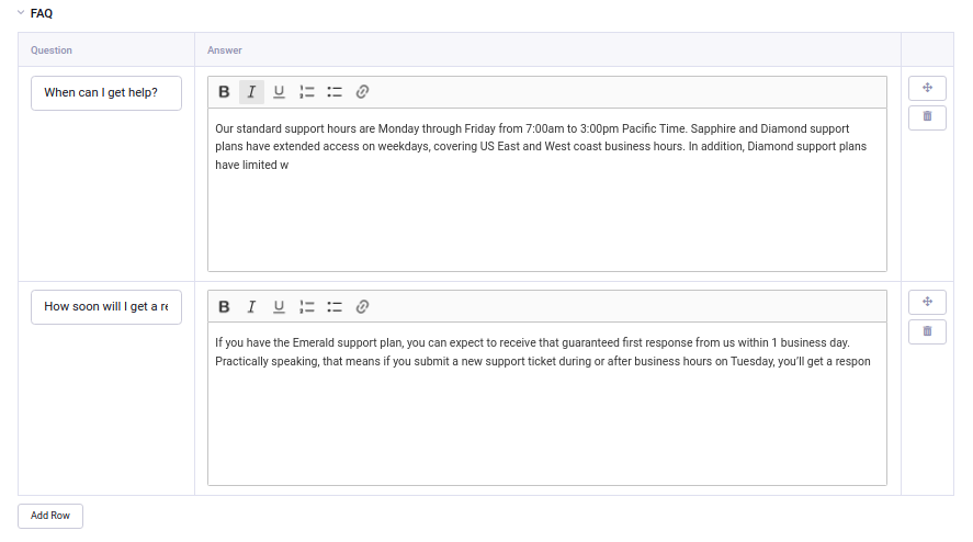
The Grid field in ExpressionEngine provides a way to enter and organize content in repeatable rows using many of the other fieldtypes. This is useful when you need to group a subset of information in your channel entry form in a logical manner, especially when that infomation may have varying numbers of rows. You can set a minimum and/or a maximum number of rows, or it can be virtually infinite.
Field Settings
Minimum Rows
Specifies the minimum number of rows this grid will have. For example, if you enter 3, the publish form will load with three empty rows ready to be populated and will not allow the publisher to delete any rows if there are only three.
Maximum Rows
Specifies the maximum number of rows this grid can have. For example, if you enter 10, the publish form will not allow the publisher to add any more than ten rows to this grid field.
Allow Reordering
Enables moving the grid rows with drag & drop to change the order.
Show Row Numbers
Enables the display of row count alongside each row in the data grid.
Grid Layout
Tip: Grid Field Layout
Auto (default) - the fields within the grid will be placed in a horizontal row on bigger screens, and stacked vertically on smaller screens or when there is not enough space on the page.
Vertical layout - The fields within the grid will always be stack vertically on the publish form.
Horizontal layout - The fields within the grid will always be stacked horizontally on the publish form.
Grid Fields
Here, you specify the columns (a.k.a. Grid Fields) you want in your main grid field. All native fieldtypes are available to be part of a Grid field – with the exception of Grid itself, File Grid and Fluid. Grid Fields within a grid may have slightly different configuration options available than they do as full fields.
Creating and Editing Grid Fields
To add a new Grid Field (column) click the “plus” icon. You must always have one field in your grid.
You can collapse or show the settings for each field by clicking on the triangle in the box.
Re-order the fields by grabbing the drag handle (three horizontal lines).
Make a copy of the field by clicking the “copy” icon – two superimposed squares.
Grid Field General Options
Just as with other field types, you can specify whether a grid field is required or not. This applies to every row in the grid.
For some fieldtypes, you can choose whether its content should be included in search. The overall grid field must also be set to Include in Search, or else this setting will not have any effect. If you change the search inclusion status of an existing grid field or column, you will need to re-index your content.
You may set a minimum width for each grid field. When the grid is set to display horizontally, any grid field with a minimum width will have that width applied to it; fields without any minimum width will be given the remaining space.
Template Tags
Contents of a Grid Field are accessed via prefixed variables representing each column, surrounded by a variable pair. For example, if you have a grid field called awards with name, details, and year_awarded fields, your template code may look like this:
{awards}
    <h3>{awards:name} - {awards:year_awarded}</h3>
    {awards:details}
{/awards}
Parameters
Grid has a number of parameters and other variables available in order to get the information you need out of it.
backspace=
backspace="7"
Just like the backspace parameter on the Channel Entries module, backspacing removes characters (including spaces and line breaks) from the last iteration of the loop.
dynamic_parameters=
dynamic_parameters="orderby|limit|sort"
The Dynamic Parameters feature permits a grid field tag’s parameters to be set “on the fly” using POST data submitted via a form. A practical use for this is to offer display options in a form on your page that your visitors can then use to select their preferred page view.
Note: This feature will only work if page caching is turned OFF for the template in which it is being used.
Every parameter available to the Grid field tag can be set dynamically.
fixed_order=
fixed_order="10|21|15"
Allows the output of the tag pair to order rows in a fixed order of row IDs.
limit=
limit="5"
Limits the number of rows output by the tag pair to the number specified. The limit will default to 100 rows if a value is not specified.
offset=
offset="1"
Offsets the number of rows output by the tag pair by the number specified.
orderby=
orderby="column_name"
Allows the output of the tag pair to be ordered by a specific column, defaults to row order as set on the channel entry publish form. Entering random will return the rows in a random order.
Note: Unlike exp:channel:entries, you can only use one column at a time for sorting – though this limitation was removed in 7.5.23.
row_id=
row_id="5"
Tells the tag pair to only output rows for the database IDs of the rows specified. Multiple rows may be specified by separating them with a pipe character:
row_id="11|5|55"
Or use “not” to exclude rows:
row_id="not 8|15|87"
search:column_name=
search:height="<=20"
Tells the tag pair to return rows only matching a certain search criteria. The behavior and syntax is identical to the search parameter of the Channel Entries module.
sort=
sort="desc"
Specifies the direction of the sorting of the tag output. Defaults to ascending.
Variables
count
{grid_field:count}
The “count” of the current row being displayed. If five rows are being displayed, then for the fourth entry the count variable would have a value of “4”.
field_row_count
{grid_field:field_row_count}
The count of the row inside the field regardless of tag output.
field_row_index
{grid_field:field_row_index}
The index of the row inside the field regardless of tag output.
field_total_rows
{grid_field:field_total_rows}
The total number of rows in the field regardless of tag output.
index
{grid_field:index}
The count of the row being displayed but starting at zero.
prev_row
{grid_field:prev_row}
    <a href="{title_permalink}/{grid_field:row_id}">Previous Award</a>
{/grid_field:prev_row}
When used as a tag pair within the parent grid field tag pair, provides access to data in the previous row in the dataset.
next_row
{grid_field:next_row}
    <a href="/awards/{url_title}/{grid_field:row_id}">Next Award</a>
{/grid_field:next_row}
When used as a tag pair within the parent grid field tag pair, provides access to data in the next row in the dataset.
row_id
{grid_field:row_id}
The database ID of the current row.
switch=
{grid_field:switch="odd|even"}
Identical to the switch variable available in the Channel Entries tag pair, but prefixed for your grid field.
total_rows
{grid_field:total_rows}
The total number of rows being returned by the current display criteria.
Modifiers
All these modifiers can be used with the tag parameters available to the primary tag, which are listed above.
:average
{grid_field:average column="height" search:height=">55"}
Given a column name containing numeric data, returns the average of the column values in that field, or in the dataset paired down by additional criteria such as search.
:highest
{grid_field:highest column="height"}
Given a column name containing numeric data, returns the highest of the column values in that field, or in the dataset paired down by additional criteria such as search.
:lowest
{grid_field:lowest column="height"}
Given a column name containing numeric data, returns the lowest of the column values in that field, or in the dataset paired down by additional criteria such as search.
:sum
{grid_field:sum column="height"}
Given a column name containing numeric data, returns the sum of the column values in that field, or in the dataset paired down by additional criteria such as search.
:table
{grid_field:table cellspacing="0" cellpadding="0" set_classes="y"}
Outputs the data in the grid field as a table. All parameters available to the primary tag are available in addition to these:
- border= Sets border attribute on the table’s HTML element
- cellspacing= Sets cellspacing attribute on the table’s HTML element
- cellpadding= Sets cellpadding attribute on the table’s HTML element
- class= Sets class attribute on the table’s HTML element
- id= Sets ID attribute on the table’s HTML element
- set_classes= If set to ‘y’, adds column name to the class attribute of each cell.
- set_widths= If set to ‘y’, sets the same column widths configured for each column in the grid field’s settings.
- width= Sets width attribute on the table’s HTML element
:total_rows
{grid_field:total_rows search:height=">55"}
When outside of a grid field tag pair, this modifier can be used to get the total number of rows in a field given a specific criteria. Useful for determining if there are any grid rows at all: {if grid_field:total_rows == 0} Grid is empty {/if}. When using parameters, wrap the tag in curly braces. Quotes around the numeric result are optional:
{if "{grid_field:total_rows search:height='>55'}" == 0} No rows with tall things {/if}
Note: Grid can process {if no_results} when existing rows are excluded by parameters such as offset, but a field with no stored rows returns without processing it. Use :total_rows to check whether the field has any rows. When nested in {exp:channel:entries}, put the Channel Entries {if no_results} block before the Grid tag pair.
:next_row
{grid_field:next_row row_id="{segment_3}"}
    Next up: <a href="/awards/{url_title}/{grid_field:row_id}">{grid_field:title}</a>
{/grid_field:next_row}
Given a row ID, this tag pair will provide access to the next row in the field criteria. The row_id may be populated via a segment variable.
:prev_row
{grid_field:prev_row row_id="5"}
    Previous: <a href="/awards/{url_title}/{grid_field:row_id}">{grid_field:title}</a>
{/grid_field:prev_row}
Given a row ID, this tag pair will provide access to the previous row in the field criteria. The row_id may be populated via a segment variable.
Examples
Checkbox and Multi Select Fields
For checkbox and multiselect single variables:
{grid_field}
  {grid_field:my_checkbox}
{/grid_field}
This would output a comma-separated list of the checkbox labels.
For checkbox and multiselect variable pairs:
{grid_field}
  {grid_field:my_checkbox}
     Value: {item}<br>
     Value: {item:value}<br>
     Label: {item:label}<br>
  {/grid_field:my_checkbox}
{/grid_field}
Date Fields
{grid_field}
  {grid_field:my_date format="%F %d %Y"}
{/grid_field}
Email Address Fields
{grid_field}
  {if grid_field:my_email}
    {grid_field:my_email:mailto title="Email about their dog" subject="Question about your dog" encode="no"}
  {/if}
{/grid_field}
File Fields
A file field variable pair:
{grid_field}
  {grid_field:my_image}
      File title: {title}
      Extension: {extension}
      Upload date: {upload_date format="%Y %m %d"}
      URL: {url}
      Custom med thumbnail url: {url:med}
  {/grid_field:my_image}
{/grid_field}
Single variable file field:
{grid_field}
  URL: {grid_field:my_image}
{/grid_field}
Relationship Fields
{grid_field}
  {grid_field:my_relationship status="open"}
      {if grid_field:my_relationship:count == 1}<h3>Relationships ({grid_field:my_relationship:total_results})</h3>{/if}

      Related entry title: {grid_field:my_relationship:title}
      Related entry's file field, med custom image size: {grid_field:my_relationship:my_file:med wrap="image"}

  {/grid_field:my_relationship}
{/grid_field}
Toggle Fields
{grid_field}
  {if grid_field:my_toggle}YES there is a toggle value!{/if}
{/grid_field}
URL Fields
{grid_field}
  <a href="{grid_field:my_url}">Your Link</a>
{/grid_field}