Shared Form View
Note. You can also build out control panel views with objects using the CP form service
ExpressionEngine’s control panel markup is very modular and consistent. Because of that, we were able to abstract out the creation of most form views to a single view file to save repeating ourselves and keeping our form markup maintainable. This view is also available to add-on developers and is recommended for built-in support for form validation.
Getting started
The concept is quite familiar. In an ExpressionEngine controller file, we will create a variable and pass it to a view. The variable will be a specifically-structured array that will describe the layout and contents of our form.
Let’s get started creating a general settings form for ExpressionEngine. We’ll start with a couple text inputs, as well as some other code necessary to render the view:
// The data we'll want to populate our form fields with
$site = ee('Model')->get('Site')
    ->filter('site_id', ee()->config->item('site_id'))
    ->first();

// Form definition array
$vars['sections'] = array(
  array(
    array(
      'title' => 'site_name',
      'fields' => array(
        'site_name' => array(
          'type' => 'text',
          'value' => $site->site_label,
          'required' => TRUE
        )
      )
    ),
    // Site short name field
    array(
      'title' => 'site_short_name',
      'desc' => 'site_short_name_desc',
      'fields' => array(
        'site_short_name' => array(
          'type' => 'text',
          'value' => $site->site_name,
          'required' => TRUE
        )
      )
    )
  )
);

// Final view variables we need to render the form
$vars += array(
  'base_url' => ee('CP/URL', 'settings/general'),
  'cp_page_title' => lang('general_settings'),
  'save_btn_text' => 'btn_save_settings',
  'save_btn_text_working' => 'btn_saving'
);
We can then render the form by returning this at the end of our controller method:
return ee('View')->make('ee:_shared/form')->render($vars);
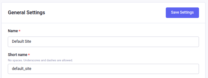
Assuming our language keys are defined above, we should end up with a form that looks like this:
Fieldset definitions
Let’s dive in closer and take a look and what makes a fieldset definition:
array(
  'title' => 'site_name',
  'desc' => 'site_name_desc',
  'fields' => array( ... )
)
This is the first level in a fieldset definition. Here are what these keys and values mean, as well as others that can be set in this dimension of the array:
| Option name | Description | Accepted values | Default value |
|---|---|---|---|
| title | Name of field, required. | String | N/A |
| desc | Description of field, required. | String | N/A |
| fields | Array of field definitions, documented below, required. | Array | N/A |
| security | Marks a setting field as potentially increasing site security, and applies the security enhance style. | Boolean | FALSE |
| caution | Marks a setting field as potentially decreasing site security, and applies the security caution style. | Boolean | FALSE |
| grid | Whether or not this fieldset is to have a Grid input, such as one generated by the GridInput service. The fieldset needs some extra styles and markup handling to show a Grid field. | Boolean | FALSE |
| attrs | Specify any extra attributes such as classes or data attributes on the parent fieldset element of the field(s). An array can be passed in the format of array('attr-name' => 'value') and multiple attributes can be specified. |
Array | N/A |
| rows | For use in textareas. Number of rows that should be displayed. | String | N/A |
| cols | For use in textareas. Number of columns (cols) that should be displayed. | String | N/A |
| group | Specify the group name this fieldset should be included in. See Toggling field visibility for more information. | String | N/A |
Individual field definitions
Fieldsets can contain multiple fields, and they are defined in the fields array mentioned above:
'fields' => array(
  'site_name' => array(
    'type' => 'text',
    'value' => $site->site_label,
    'required' => TRUE
  )
)
The key for each field definitions is the field’s input name. We’ll dive deeper into that array to see how we can show and customize different kinds of fields. Here are the keys available to a field definition array:
| Option name | Description | Accepted values | Default value |
|---|---|---|---|
| type | Type of field, required. All field types are listed below. | String name of valid field type names | N/A |
| value | Value of field to populate on page load. | String (or Array when type is ‘checkbox’) | N/A |
| required | Whether or not the field is required for form submission, applies the required style. | Boolean | FALSE |
| disabled | Whether or not the field input element is disabled. | Boolean | FALSE |
| choices | For checkboxes, radio buttons and select fields, sets the selectable choices for that field. Array format is 'my_value' => lang('my_label'). If you need instructional text, structure your array like this: 'my_value' => [ |
Array | |
| disabled_choices | For checkboxes, indicates options that are not currently selectable with an array of field values whose checkboxes should be disabled, e.g. ['value', 'another'] |
Array | NULL |
| maxlength | Sets the maxlength= attribute on text inputs. | Boolean | FALSE |
| placeholder | Sets the placeholder= attribute on text inputs. | String | NULL |
| no_results | For checkboxes, radio buttons and select fields, can be set to show a “no results” message and a call-to-action link button to create content that would populate options for the field. | Array | NULL |
| label | Normally, the label for the field is specified in the fieldset definition, but some field types may allow a secondary label to be set such as the short-text field because it is normally paired with other short-text fields and each may need their own label. | String | NULL |
| encode | For checkboxes, radio buttons and select fields, whether or not to encode the items’ display value for security. | Boolean | TRUE |
| content | When type is set to html, allows for any freeform markup to be used as the field. | String | NULL |
| group_toggle | If this field is to toggle the visibility of other fields, specifies the rules for that toggling. See Toggling field visibility for more information. | Array | N/A |
Available field input types
Here are the values available to the type key documented above:
| Field name | Description |
|---|---|
| text | Regular text input. |
| short-text | Small text input, typically used when a fieldset needs multiple small, normally numeric, values set. Note: Currently use of this field requires the inclusion of an option label. |
| textarea | Textarea input. |
| select | Select dropdown input. |
| dropdown | A rich select dropdown . |
| checkbox | Checkboxes displayed in a vertical list. |
| radio | Radio buttons displayed in a vertical list. |
| yes_no | A Toggle control that returns either y or n respectively. |
| file | File input. Requires filepicker configuration. NOTE: This input provides a standard file upload button allowing selection and uploading of a file from the users environment. You will need to provide your own back-end code to do something with the uploaded file. If you want to insert a standard EE File picker see notes later in this article. |
| image | Image input. Like file but shows an image thumbnail of the selected image as well as controls to edit or remove. Requires filepicker configuration. |
| password | Password input. |
| hidden | Hidden input. |
| html | Freeform HTML can be passed in via the content key in the field definition to have a custom input field. |
Given what we now know about how to define field definitions and the types of fields available, let’s add a few more fields to our form:
$vars['sections'] = array(
  array(
    array(
      'title' => 'site_name',
      'fields' => array(
        'site_name' => array(
          'type' => 'text',
          'value' => $site->site_label,
          'required' => TRUE
        )
      )
    ),
    array(
      'title' => 'site_short_name',
      'desc' => 'site_short_name_desc',
      'fields' => array(
        'site_short_name' => array(
          'type' => 'text',
          'value' => $site->site_name,
          'required' => TRUE
        )
      )
    ),
    array(
      'title' => 'site_online',
      'desc' => 'site_online_desc',
      'fields' => array(
        'is_system_on' => array(
          'type' => 'inline_radio',
          'choices' => array(
            'y' => 'online',
            'n' => 'offline'
          )
        )
      )
    ),
    array(
      'title' => 'site_offline_description',
      'fields' => array(
        'site_offline_description' => array(
          'type' => 'textarea',
          'rows' => 6,
          'attrs' => 'cols="100"', // Textarea rows and cols can be added here as well
          'value' => $site->site_label,
          'required' => TRUE
        )
      )
    ),
  ),
  'date_time_settings' => array(
    array(
      'title' => 'timezone',
      'desc' => 'timezone_desc',
      'fields' => array(
        'default_site_timezone' => array(
          'type' => 'html',
          'content' => ee()->localize->timezone_menu(
            set_value('default_site_timezone') ?: ee()->config->item('default_site_timezone')
          )
        )
      )
    ),
    array(
      'title' => 'date_time_fmt',
      'desc' => 'date_time_fmt_desc',
      'fields' => array(
        'date_format' => array(
          'type' => 'select',
          'choices' => array(
            '%n/%j/%y' => 'mm/dd/yy',
            '%j-%n-%y' => 'dd-mm-yy',
            '%Y-%m-%d' => 'yyyy-mm-dd'
          )
        ),
        'time_format' => array(
          'type' => 'select',
          'choices' => array(
            '24' => lang('24_hour'),
            '12' => lang('12_hour')
          )
        )
      )
    ),
    array(
      'title' => 'include_seconds',
      'desc' => 'include_seconds_desc',
      'fields' => array(
        'include_seconds' => array('type' => 'yes_no')
      )
    )
  )
);
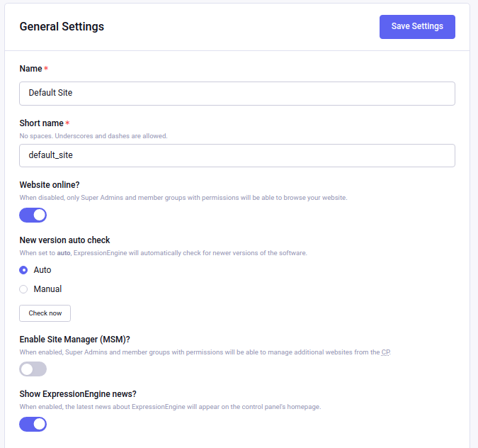
Notice we’ve made use of many more field types here. Also notice, we aren’t setting values on many of our new fields, that’s because we’re working with site-wide configuration settings. When a value is not specified for a field, the shared form view automatically looks in the site’s configuration for a value.
With these additions, our form should now look like this:
Our form is fully rendered and ready to write a form handler for without having to write any markup.
Adding an EE File picker to your shared view form
It is possible to add a standard EE file picker to your form. The EE File picker is used through out the EE CP system to allow access to files / images saved in the Files area, give users the option to upload additional files to the Files area, and provide a visual summary of the current content of a field via a thumbnail image.
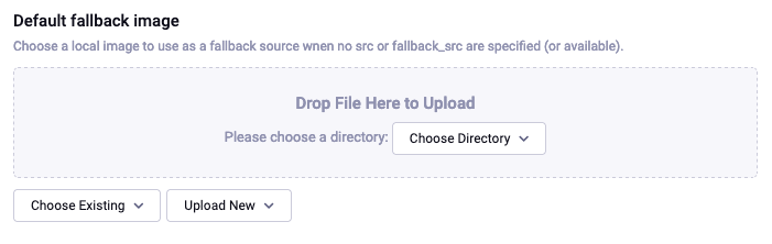
The unfilled standard EE File picker looks like this:
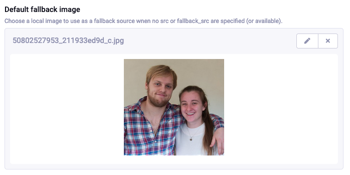
When the field has an existing value it looks like this:
To add this kind of picker to your form you need to define an HTML type input and include a call to an EE internal function. The internal function is from a library that is not currently documented, so limited explanation of the parameters applicable to this function are included below.
The input definition you need to add will look something like this (assuming the file is to be held in php variable $file_field):
// ----------------------------------------
// Define an EE type File picker
// ----------------------------------------

array(
    'title' => 'EE_file_picker_example',
    'desc' => 'EE_file_picker_example_desc',
    'fields' => array(
        'file_field' => [
            'type' => 'html',
            'value' => $file_field,
            'required' => false,
            'content' => ee()->file_field->dragAndDropField('file_field', $file_field, 'all', 'image'),
        ]
    )
)
The function concerned (ee()->file_field->dragAndDropField()) has the following parameters…
dragAndDropField($field_name, $data = '', $allowed_file_dirs = 'all', $content_type = 'all')
| Parameter | Type | Description |
|---|---|---|
| $field_name | String |
The name of the field |
| $data | String |
The data stored in the file field e.g. {file:XX:url} or {filedir_x}filename.ext |
| $allowed_file_dirs | String |
Whether to show one upload destination or all uploade destinations Either ‘all’ or ONE directory ID |
| $content_type | String |
The content type allowed. Either ‘all’ or ‘image’ |
| Returns | String |
Fully rendered file field |
$file_field = ee()->file_field->dragAndDropField('file_field', $file_field, 'all', 'image');
Toggling field visibility
Sometimes you may want to toggle the visibility of certain fields based on the value of another field. A common case is selecting an option in a dropdown or radio button and having a different set of fields appear or disappear. This can be achieved automagically with form groups. Take this small example. We have a small form with a select field, then two sections of fields we want to show based on the value of the select box. Here’s how we would construct this form normally:
$vars['sections'] = array(
  array(
    array(
      'title' => 'type',
      'fields' => array(
        'type' => array(
          'type' => 'select',
          'choices' => array(
            'text' => lang('text'),
            'image' => lang('image')
          ),
          'value' => $type
        )
      )
    ),
  ),
  'text_options' => array(
    array(
      'title' => 'text',
      'fields' => array(
        'text' => array(
          'type' => 'text',
          'value' => $text
        )
      )
    ),
  ),
  'image_options' => array(
    array(
      'title' => 'image_path',
      'fields' => array(
        'image_path' => array(
          'type' => 'text',
          'value' => $image_path
        )
      )
    )
  )
);
Pretty standard form. Now we want to modify it to give it the logical groupings we want and to specify which field is going to control the toggling:
$vars['sections'] = array(
  array(
    array(
      'title' => 'type',
      'fields' => array(
        'type' => array(
          'type' => 'select',
          'choices' => array(
            'text' => lang('text'),
            'image' => lang('image')
          ),
          'group_toggle' => array(
            'text' => 'text_options',
            'image' => 'image_options'
          ),
          'value' => $type
        )
      )
    ),
  ),
  'text_options' => array(
    'group' => 'text_options',
    'settings' => array(
      array(
        'title' => 'text',
        'fields' => array(
          'text' => array(
            'type' => 'text',
            'value' => $text
          )
        )
      ),
    )
  ),
  'image_options' => array(
    'group' => 'image_options',
    'settings' => array(
      array(
        'title' => 'image_path',
        'fields' => array(
          'image_path' => array(
            'type' => 'text',
            'value' => $image_path
          )
        )
      )
    )
  )
);
Notice what’s different. We added a group_toggle key to the select’s field definition that specifies for each value of the select dropdown which group to show. Next, we needed to specify what fields are in which group. We did that by adding a group key to each section, and then nesting those field definitions under a settings key. If we have multiple fields in that section, they will all be shown/hidden based on the value of our group_toggle field. If we just want to tag specific settings to toggle and not an entire section, we can set the group key on a fieldset definition and allow all the fields to share the same section of the form:
$vars['sections'] = array(
  array(
    array(
      'title' => 'type',
      'fields' => array(
        'type' => array(
          'type' => 'select',
          'choices' => array(
            'text' => lang('text'),
            'image' => lang('image')
          ),
          'group_toggle' => array(
            'text' => 'text_options',
            'image' => 'image_options'
          ),
          'value' => $type
        )
      )
    ),
    array(
      'title' => 'text',
      'group' => 'text_options',
      'fields' => array(
        'text' => array(
          'type' => 'text',
          'value' => $text
        )
      )
    ),
    array(
      'title' => 'image_path',
      'group' => 'image_options',
      'fields' => array(
        'image_path' => array(
          'type' => 'text',
          'value' => $image_path
        )
      )
    )
  )
);
You can also include multiple groups into group parameter if the toggle needs to switch on and off several groups; those need to be separated with a pipe | delimiter. Example:
‘group’ => ‘text_options|image_options’,
Finally, we must include the JavaScript to make it all work:
ee()->cp->add_js_script(array(
  'file' => array('cp/form_group'),
));
Form validation
The shared form view is ready to take a form validation result object from the Validation Service. After you receive the result object, simply assign it the view’s variable’s array:
$vars['errors'] = $result;
As long is the field names in validation match up with the form input names, the shared form view will automatically show error messages next to their respective fields and apply the appropriate styles denoting field errors.
Tabs
The shared form view is capable of adding tabs. To do so assign a tabs variable to the view’s variable’s array:
$vars['tabs'] = $tabs;
The view expects the tabs variable to be an associative array where the key is the language key for the text of the tab and the value is the rendered HTML of the tab itself:
$tabs = array(
  'hello_world' => '<h2>Hello world!</h2>',
  'goodbye'     => '<p>What, so soon?</p>'
);
Adding forms to tabs is a matter of rendering our form data to HTML. In many cases this simply means rendering a sections array:
$permissions_tab = '';

// Assuming $sections looks like $var['sections'] as above
foreach ($sections as $name => $settings)
{
  $permissions_tab .= ee('View')->make('ee:_shared/form/section')
    ->render(array('name' => $name, 'settings' => $settings));
}

$var['tabs'] = array(
  'permissions' => $permissions_tab
);