Selectable Buttons Fieldtype
Selectable Button fields allow publishers to choose either multiple or single items from a list depending on the setting.
Field Settings
Name
The name of the field. The field’s names is used as the label for inputs and is what is displayed on the Entry Publish Tab.
Short name
The short name of a field is used to reference the field in templates and other code. The short name must be unique and contain only alpha-numeric characters, underscores, and dashes (no spaces or other special characters).
Instructions
The field instructions display on the Entry Publish Tab and Channel Forms. Instructions allow for a description of the field or other information that will help publishers understand the field’s purpose.
Require field?
When enabled (and not conditionally hidden), this option will make the field required to submit the publish form.
Include in search?
When enabled, the field will be included in searches.
Hide field?
When enabled, the field will be collapsed on the publish form by default.
Make conditional?
When enabled, the field will only display when conditions of other field(s) are met. See Conditional Fields docs for more information.
Allow multiple selections?
Selectable Buttons allow switching between single selection and multiple selection mode. Enable this option to allow publishers to choose multiple options. Disabling this option (default) will allow publishers to only choose a single option.
Text Formatting
Specifies how the entered-text will be formatted when rendered on the front-end. Most items will be entered will be single-lined and thus treated as a single paragraph by most text-processing plugins.
Buttons Options
This is where the list of items to select from is created. You have several ways to populate these items.
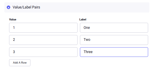
Value/Label pairs
The default choice is to enter a series of values and labels separately. Typically when constructing an HTML form, fields will have a different value than their presentation label. For example, if you want to enable the author to choose from a list of numbers, you might want the database to represent the actual numerical value:
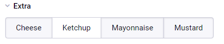
For a Selectable Buttons field this results in an interface with only the labels visible:
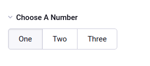
1, 2, or 3 is what gets stored in the database and is then the value used for the Channel Entries tag search parameter. But both the value and the label are accessible via the field’s template tags, which is outlined below.
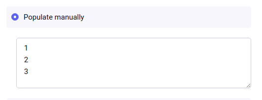
Manual population
You may also enter each item in the provided textarea, separating each item on a single line. Each line will represent the choices value AND label.
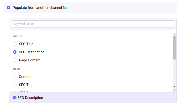
Populate from channel field
Or, the list may be populated by the contents of another channel field from your site.
Template Tags
Multiple Items
When allowing multiple items to be selected, Selectable Buttons will usually be rendered using a variable pair.
{field_name}
    {item}<br>
{/field_name}
The following variables are available inside field’s tags pair:
| Variable | Description |
|---|---|
{item} |
Label of selected item |
{item:label} |
Label of selected item |
{item:value} |
Value of selected item |
{count} |
Counter for each of selected items, starting with 1 |
{index} |
Counter for each of selected items, starting with 0 |
{total_items} |
Total number of selected items |
By default, {item} will render the item’s label. To access the value and label separately, simply add a :value or :label modifier to the {item} variable:
{field_name}
    Value: {item}<br>
    Value: {item:value}<br>
    Label: {item:label}<br>
{/field_name}
Tip: You can use a single variable, e.g. {field_name}, and you will get a comma-separated list of the labels.
Single Items
If “allow multiple selection” setting is turned off, just use the modifier to the single variable name, and do not use a variable pair:
Label: {field_name}<br>
Value: {field_name:value}<br>
Label: {field_name:label}<br>
In all cases, these variables are also available as conditionals. Let’s say you had the following value/label options:
| Value | Label |
|---|---|
| 1 | One |
| 2 | Two |
| 3 | Three |
Given that the selection option is 2/Two:
{if field_name == 'Two'}Yep!{/if}
{if field_name:value == 2}Yep!{/if}
{if field_name:label == 'Two'}Yep!{/if}
Tip: It is recommended that you use the value in conditionals, as it typically will not change over time. That way, if you ever need to change the wording, spelling, or even casing of labels in your publish/edit UI, you will not need to modify your templates.
Tip: Checkboxes, Multiselect and Selectable Buttons all default to showing the label. Radio Buttons and Selects default to showing the value.
NOTE: For Select fields used in Custom Member Fields and Category Group Details Tab, the modifiers are not currently available in conditionals, and must be based on the value, e.g. {if some_cat_field == 2}
Parameters
limit
This parameter limits the number of selected items output by the tag. It works for both the single variable, as well as the tag pair.
markup
When allowing for multiple selections, a single tag will display a comma separated list of values. If you want an HTML list, you can use markup=”ul” or markup=”ol” to change the output to the equivalent html list
{field_name markup='ul'}
Which will render as
<ul>
    <li>Green</li>
    <li>Blue</li>
    <li>Orange</li>
</ul>
backspace
Backspacing removes characters (including spaces and line breaks) from the last iteration of the loop when using a variable pair. For example, if you put a <br> tag after each item you’ll have this
{field_name backspace='5'}
    {item}<br>
{/field_name}
Which will render as
Green<br>
Blue<br>
Orange
In this example, we do not want the <br> tag after the final item. Simply count the number of characters (including spaces, tabs, and line breaks) you want to remove and add the backspace parameter to the tag. The <br> tag has 4 characters plus a new line character between it and the closing tag.