Other Channel Fields
For all of the other channel fields, you have several options for outputting the form field.
Custom Fields Tag Pair
The Custom fields tag pair will conveniently show all your custom fields, but it has limited design flexibility.
{custom_fields}

    <label for="{field_name}">{if required}* {/if}{field_label}</label>
    {field_instructions}

    {if error}
      <p class="error">{error}</p>
    {/if}


    {if text}
      <input type="text" dir="{text_direction}" id="{field_name}" name="{field_name}" value="{field_data}" maxlength="{maxlength}" size="50">
    {/if}

    {if grid}
      {display_field}
    {/if}

    {if multiselect}
      <select id="{field_name}" name="{field_name}[]" multiple="multiple">
        {options}
          <option value="{option_value}"{selected}>{option_name}</option>
        {/options}
      </select>
  {/if}

{/custom_fields}
{field:}
To output an individual field, the {field:} tag is available:
zipcode, you would use:<label for="zipcode">Your Custom Field (Text field)</label>
<div class="error">{error:zipcode}</div>
{field:zipcode}
The field tag should output all of the required html needed for either a new entry or an edit.
Manually Constructed Input Fields
In rare cases, the field tag may not be flexible enough for the desired output. In that case, most native fields can be manually coded.
Checkbox field
{options:my_field_name}
  <input type="checkbox" name="my_field_name[]" value="{option_value}" {checked}>
  {option_name}</br>
 {/options:my_field_name}
See the {options:my_field_name} tag pair.
Date field
<input type="text" id="my_field_name" name="my_field_name" value="{my_field_name}" size="50">
Note: inclusion of the localization select field is not currently supported, whether constructing the field manually or using variables.
File field
There are several additional inputs that may be specified when manually constructing a file field:
my_field_name_directory- the file directory the image is assigned to. This field is required if submitting a file.my_field_name_hidden_directory- if specified, this will take precedence overmy_field_name_directoryand can be used to allow editing.my_field_name_hidden_file- the name of an existing, uploaded file. If specified, this will take precedence overmy_field_nameand can be used to allow editing.
If editing entries, you will need to specify the existing directory and file name or the file content will be lost :
<input type="file" name="my_field_name" />
<input type="hidden" name="my_field_name_directory" value="1" />
<input type="hidden" name="my_field_name_hidden_file" value="{my_field_name}{file_name}{/my_field_name}" />
Note: For the hidden_file input, use the variable pair to pull in only the {file_name} since we’re already providing the directory above.
Note: If you want to allow users to change the file associated with the entry when editing, you will need to provide a way (typically Javascript) to reset the my_field_name_hidden_file to empty.
Grid field
Manual construction of grid type fields is not supported. Most customization of grid fields can be done by overriding the CSS.
Multi Select field
<select name="my_field_name[]" id="my_field_name" multiple size="2">
  {options:my_field_name}
    <option value="{option_value}"{selected}>{option_name}</option>
  {/options:my_field_name}
</select>
See {options:my_field_name} tag pair.
Radio field
{options:my_field_name}
  <input type="radio" name="my_field_name" value="{option_value}" {checked}>
    {option_name}</br>
{/options:my_field_name}
See {options:my_field_name} tag pair.
Relationship field
Simple relationship fields with only 1 relationship allowed are very similar in format to Multi Select fields, though note the slight variation in name:
<select name="my_field_name[data][]" id="my_field_name">
  {options:my_field_name}
    <option value="{option_value}"{selected}>{option_name}</option>
  {/options:my_field_name}
</select>
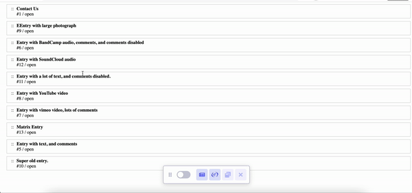
For relationship fields that allow multiple selections, you may also set the reorderable drag-and-drop lists:
{exp:channel:entries channel="yourChannel"}
  <ul id="list-group">
    {relationship_field}
        <li class="list-item">
            <div class="list-item__handle">::</div>
            <div class="list-item__content">
                <div class="list-item__title">{relationship_field:title}</div>
                <div class="list-item__secondary"><span> #{relationship_field:entry_id} / </span>{relationship_field:status}</div>
            </div>
        </li>
    {/relationship_field}
  </ul>
{/exp:channel:entries}
You would need a bit of Javascript code (the example below is using SortableJs library):
<script src="https://cdn.jsdelivr.net/npm/sortablejs@latest/Sortable.min.js"></script>
<script>
    var el = document.getElementById('list-group');
    var sortable = Sortable.create(el);
</script>
Add CSS:
<style>
    #list-group {
        list-style-type: none;
        padding: 0;
        margin-left: 15px;
    }
    #list-group .list-item{
        margin-bottom: 10px;
        border: 1px solid #cecece;
        padding: 5px 15px;
        background: #fff;
        display: flex;
    }
    #list-group .list-item__title {
        font-weight: bold;
    }
    #list-group .list-item__handle {
        cursor: move;
        cursor: -webkit-grabbing;
        margin-right: 10px;
    }
</style>
Select field
<select name="my_field_name" id="my_field_name">
  {options:my_field_name}
    <option value="{option_value}"{selected}>{option_name}</option>
  {/options:my_field_name}
</select>
See {options:my_field_name} tag pair.
Text Input field
<input type="text" name="my_field_name" id="my_field_name" value="{my_field_name}">
Textarea field
<textarea name="my_field_name" id="my_field_name" cols="90" rows="10">{my_field_name}</textarea>